
Perhaps the single most popular third-party tool for genetic genealogy is the Shared cM Tool at DNA Painter. This simple yet elegant utility lets you plug in an autosomal DNA amount and shows how you might be related to your DNA match.
The example below shows the possible relationships to a 200-cM match by highlighting them in the chart.

There are so many possibilities because all genetic relationships (except for identical twins and parent–child) show variation around an average. Half-siblings average about 1750 cM, sometimes more, sometimes less. First cousins (1Cs) average about 870 cM, but it can be higher or lower. Same for other relationships.
You can click on any cell in the chart to see a histogram. These are self-reported values submitted by volunteers to the Shared cM Project by Blaine Bettinger.
 The histograms show you how likely the centimorgan amount is for that relationship. You can see that, while 200 cM is certainly possible for a half first cousin (h1C) match, it’s not very likely. Only nine of 691 reported h1Cs shared DNA in that range.
There are histograms for the other relationships, too.
How does that help us when we have a 200 cM match to someone we don’t know? It doesn’t really, except to give a general sense of likely versus maybe versus probably not.
Fortunately, the Shared cM Tool includes a second, independent set of data that does quantify how much more likely some possibilities are over others.
 In addition to the relationship chart, the Shared cM Tool offers a table showing the probability for each of the relationship groups. For our 200-cM match, you can not only see that h1C is unlikely, but you can see how much less likely it is. There’s only a 3% chance that this match falls into the h1C group (which also includes other relationships), while there’s a 45% chance each for the 2C (2nd cousin) and 2C1R (2nd cousin once removed) groups. That’s where you’d want to start looking for a connection to an unknown 200-cM match.
A Two-in-One Tool
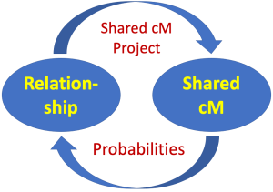
But wait, don’t the histograms give you the probabilities?, you may ask. As it turns out, no, they don’t! The Shared cM Tool actually presents two completely independent sets of data. Mad props to designer Jonny Perl for integrating them so seamlessly most people don’t even realize that they’re different.

The probabilities in the Shared cM Tool come from data simulated by AncestryDNA and published in their Matching White Paper (Figure 5.2). This graph shows the likelihood that a match belongs to a relationship group based on the shared centimorgan amount.
To read the graph, find a centimorgan value along the vertical axis, then look straight across to see which colored line has the highest probability (that is, which line is furthest to the right).
Fortunately, you don’t have to do that manually for each centimorgan amount. The Shared cM Tool does it for you, in the probability table. Not coincidentally, the probabilities are also the data underlying the What Are the Odds? tool, a.k.a. WATO.
But how are the probabilities different from the Shared cM Project histograms?
It turns out, they’re kinda of the opposite of one another. With the Shared cM Project, you already know the relationship, and the histograms show how likely each centimorgan amount is. Conversely, with the Shared cM Tool probabilities and WATO, you know the centimorgan amount and want to know how likely each relationship is.
And you can’t just convert from the one dataset to the other, at least not directly.
You Can’t Get There From Here
To understand why, you have to think about how families are structured. For example, I have eight first cousins who have a total of 15 children. That is, I have nearly twice as many 1C1Rs as 1Cs. By the same token, we almost always have more 2Cs than 1Cs and more 3Cs than 2Cs and so on.
That means we need to consider population growth (the average number of children per generation) to convert from a dataset like the Shared cM Project’s histograms to a predictive tool like WATO.
Malcolm Peach has done some nifty modeling that shows what I mean. First, he did an Ancestry-like analysis but without taking population growth into account. Then, he assumed 2.5 children per generation and redid the calculations. (The latter aligns nicely with Ancestry’s Figure 5.2.)
 Here, I’ve overlaid the two so we can compare them. The paler “ghost” lines were modeled without a population growth model and the solid lines assume 2.5 children per generation. When you factor in population growth, just about all of the curves shift to the right.
That figure’s got a lot going on, so let’s zoom in on the 1C (teal line) versus1C1R (mustard line) comparison to better understand it.
 When we do, you can see that the relationship lines intersect at different points in the two analyses.The ghost lines cross at roughly 595 cM; that’s where a match would be equally likely to be a 1C or a 1C1R if we ignore population growth. But if you plug 595 cM into the Shared cM Tool, that’s not what you get.

A match of 595 cM is more than three times as likely to be a 1C1R than a 1C … which is exactly what we’d expect if we have more 1C1Rs in the first place! It’s also about what we get when we look at 595 cM on the solid lines on the graph.
When we consider population growth, the break-even point between 1C and 1C1R is actually about 655 cM. That’s where a match is equally likely to be one or the other. (You can see the Shared cM Tool probabilities here.)
If you scroll back up to the first of Malcolm’s graphs, you’ll see that the effects of population growth increase at lower centimorgan amounts and for more distant relationships. That is, the lines shift more between the two models. Again, that’s exactly what we expect.
The Next Big Thing
Now, if you’re thinking ahead, you may be wondering: But what if my ancestors averaged more (or less) than 2.5 kids per generation?
And that’s a great question! It’s exactly the sort of question you should be asking if you’ve followed this explanation! Because it matters. The larger the families, on average, the more the relationship probabilities are affected.
There is no one-size-fits-all model that will work for every family. The future of genetic genealogy tools will be a custom approach. But for now, 2.5 kids/generation is a decent approximation.
Updates to This Post
5 March 2022 – Corrected a sentence to refer to the Shared cM Tool rather than the Shared cM Project.
Leah, your articles are brilliant! I teach in two summer STEM camps for 12-13-year-olds at two universities in Southern Utah (SUU & DSU). I specialize in telling the story of science and in particular, DNA. This article has lots of intriguing math and will help my students see the importance of everyday math.
Thank you for the kind words and especially for teaching the next generation the beauty and wonder of science!
Thanks for more great data. I think that there is probably more correlation to population growth rates and generational position of couples. Families were much larger on average in the 1800’s than they were in the 1960’s. Of course there is variation in every family and occupation may have also played a role in family size.
The shared centimorgan tool is an excellent resource, particularly when you utilize the histograms associated with each relationship. I will study Malcolm’s model. very cool.
Always glad to have a new post from you!
Great point about the population growth rate changing over time. In 1800, US women averaged 7 children. That had dropped to about babies per woman by 1935, jumped to nearly 4 in the baby boom, and has dropped again to less than 2 today. There’s a nifty-but-awkward graph at gapminder. You have to click the play button to get it to sketch out the data. https://bit.ly/32bcyi2