In “Escape from the Overlap Zone“, I wrote about a way to distinguish between relationships for which the shared amount of DNA in centimorgans is essentially the same. (Terms in bold are defined in the glossary.) For example, half siblings, grandparents, and aunts/uncles all share between about 1100 and 2500 cM, but you can sometimes tell them apart by looking at the number of segments in addition to the total amount of shared DNA.
These broadly overlapping relationship types are called various things by different people. AncestryDNA’s Matching White paper refers to them by meiosis level (although I disagree with their use of the term … more here). The DNA Detectives Facebook team refers to them as “groups”. Blaine Bettinger, in his latest version of the Shared cM Project, calls them “clusters”. The International Society of Genetic Genealogy wiki simply organizes them by (average) total shared DNA.
No matter what you call them, these overlapping ranges reflect the fact that some distinct biological relationships are expected to share the same amount of DNA. For example, grandparent–grandchild, aunt/uncle–niece/nephew, and half siblings form an overlapping set, while great grandparent–great grandchild, first cousins, great-aunt/uncle–great niece/nephew, half-aunt/uncle–half niece/nephew form another.
Worse, the range for one group or cluster can overlap that of a different one. A half sibling who shares less DNA than average and a first cousin who shares more than average can occasionally match on the same amount of DNA and thus seem indistinguishable. The chart below is from Figure 5.2 in the 2016 AncestryDNA Matching White Paper. It has been modified to list some of the relationships that correspond to each group. There is a range between roughly 1100 and 1500 cM (black box) where half siblings (in the dark green group) and first cousins (in the red group) can theoretically overlap.
If you already know how you are related to a DNA match who falls in an overlap zone, the amount of shared DNA is an interesting conversation piece. On the other hand, if you have unknown biological parentage, a DNA match in the overlap zone can be torment.
Julie’s Search
This conundrum recently became real when I was asked to help on an adoptee case in the DNA Detectives Facebook group. Julie Jackson (her name is used with permission) had been searching for her biological father for all of her adult life. Since 2014, she has chronicled her search in a blog, which I highly recommend reading. It starts here. If you want to go directly to the chapters most relevant to this blog post, you can pick up her story here.
Julie had recently narrowed her birth father down to one of two brothers: Clive, who has passed away, and Max, whose whereabouts are unknown. Clive’s son Rob had agreed to take a DNA test. Rob would either be Julie’s half brother or her first cousin, and the DNA test was supposed to determine which.
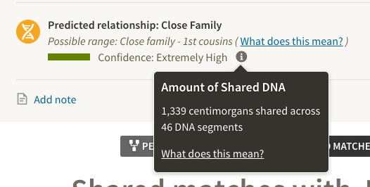
You know where this is headed, right? This is what Julie saw when Rob’s results came back:
Ouch. Very few relatives of any flavor share that amount DNA, but those that do can be in either the half-sibling category or the first cousin one. Comparing Julie and Rob at GEDmatch showed 1407 cM shared over 29 segments, still in the overlap zone. I refer regularly to this chart (described in more detail here), which indicated that there’s a roughly 91% chance that Rob was Julie’s half brother and 9% that he’s her first cousin. One of the DNA Detectives, Lauren McGuire, observed that Julie and Rob share almost all of chromosome 8, with only a tiny break, and most of chromosome 22, again pointing to half siblings but not completely ruling out cousins. It simply wasn’t the definitive answer Julie needed, especially after all she’d been through already. (Spoiler alert! Read her blog.)
Enter Simulations
What we needed was thousands of half-sibling and first-cousin comparisons for which we knew the shared DNA amount, number of segments, and segment size to give us a sense of how likely (or unlikely) it was that Rob was a half brother. For a half sibling, we’d expect fewer, larger segments and for a first cousin we’d expect more, smaller segments. We also wanted that data to be from the same source, like GEDmatch, because each testing company reports different values for the exact same matches. Even the Shared cM Project didn’t meet our criteria, because it doesn’t have enough reported values for those two relationships from GEDmatch.
Computer simulations, on the other hand, can generate thousands of data points for a given scenario in minutes. Dr. Andrew Millard of Durham University, UK, was once again kind enough to run some numbers for Julie’s case. First, here are the relationships he modeled.
Julie is person #10 in the pedigree, #11 (green) represents Rob if he’s her half brother (meaning #4 is Clive), and #13 (purple) represents Rob if he’s a first cousin (meaning #4 is Max and #8 is Clive). For the sake of interest, Andrew also modeled a first cousin through an aunt (#12, orange).
Now, let’s look at the results for total shared DNA (left–right axis) and number of segments (up–down axis). Julie and Rob’s GEDmatch results are plotted with the black circle and their Ancestry results with the black triangle. (Andrew’s simulations are meant to mimic GEDmatch; you can see what a difference Ancestry versus GEDmatch makes.)
If you consider only the left–right axis, you can see that most of the simulated relatives sharing 1407 cM are half siblings, but a few are first cousins. Similarly, looking only at the up–down axis, 29 segments doesn’t help at all to distinguish cousins and half siblings. But, when we consider both factors together, we see that the black circle is well outside the purple “cloud” for a first cousin via an uncle. It’s near the edge but inside the green one for half siblings. Great news!
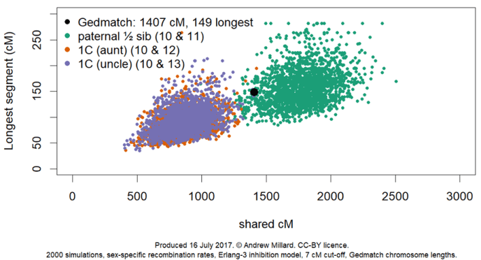
Lauren McGuire had earlier pointed out that the longest segment suggested a half-sibling relationship between Julie and Rob. A very long segment is less likely to survive the extra generations between first cousins than between siblings. Andrew modeled longest segment, as well:
Again, according to this version of the simulation, Julie and Rob are in the half-sibling cloud. If you look closely, there’s a single purple dot (first cousin) that is partially covered by the black one (the Julie–Rob comparison), meaning that longest segment still leaves a sliver of doubt. However, coupled with the other data (total cM, number of segments), we can safely conclude that Julie and Rob share a father.
After a lifetime of searching and years of doing genetic genealogy, Julie finally knows who her father was.
~~~~~~~~~~


Thanks for all your hard work-and sharing!
And that my friends, is how I gained a sister… phew!
Thank you to all who assisted in deciphering the data and of course Julie, who never stopped searching.
And thanks to you for being open to new discoveries.
These are excellent charts.
Which program was used to create them ???
Is the program readily available ???
Alan, the simulations are my own programming using the statistical package R. The style of charts is chosen from many options in R. The colour scheme is Dark2 from ColorBrewer and designed to be colour-blind friendly (http://colorbrewer2.org/#type=qualitative&scheme=Dark2&n=3) . The pedigree is drawn using the R package GENLIB. I will be writing up the simulatons program and making something available eventually.
Andrew
Excellent – this may be very helpful, especially for adopted people trying to trace their maternal / paternal lines.
Cheers
This is fantastic work, thank you for sharing. Do you intend on simulating the other overlap zones between clusters/groups as shown in the AncestryDNA figure 5.2? I wonder if looking at number of segments and longest segment length in those instances would also show distinct scatter plot groups. It could help people further define what relationship their shared DNA would indicate in conjunction with their age/birth year differences. Thanks again for your contribution!